I want to talk about fonts. I have plenty of other things I should be doing. Writing my book, for starters. But I started reading Dante's
Divine Comedy for some inspiration and now I have too many thoughts, especially of which circle in hell I'm going to. I'm trying to let the ideas marinate for a while so I don't end up changing my whole story. I have practical duties calling, too. I just got back in town and have to do all my laundry, repack, and clean the house by tomorrow morning, because I'm going back out-of-town, and will be returning with visitors on Saturday. Instead, I choose to embark upon a typography rant.
The rant begins with this statement: I honestly don't hate many things, but I despise Comic Sans. It started many years ago, when I was in graduate school, studying to be an English teacher. While at the time I didn't know anything about serifs or ligatures, something deeply unsettled me when my peers would turn in papers with titles looking like this:
Racial Implications
of Flexible Grouping. It just felt wrong. Close your eyes and imagine your Grandma in a bikini or your Grandpa in a speedo. Why does that feel so wrong? No, not because "they don't have the figure for it." What's wrong with you? It's because they are old and deserve respect and you should give it to them. I was baffled, but some of them were going on to be middle school teachers and I even had a few professors who used it. I let it go. For a while.
Now, I've been teaching for ten years and I am a font despot. I include the following flowchart on my class intro Powerpoint. When that didn't seem enough, I included the following rationale on my website:
 |
| ^The only advice I feel comfortable giving^ |
You are never allowed to turn in any papers in Comic Sans. Why? Ethos. That's why. Unless you are trying to capture the voice of a kindergarten teacher or a seven-year-old, it's rhetorically inappropriate. And even then, it's just lazy. Instead...why not try employing Anglo-Saxon diction or a verisimilitic selection of detail? What's that you say? You're just trying to soften the blow of a harsh message? Again--lazy. That's why purposeful passive voice, inductive arrangement, periodic sentences, and euphemisms exist (just to name a few). Remember: everything's an argument, and if you use this font, the only arguments you're making are a) that you hate me and/or b) that you hate winning arguments. If neither are true, go with another font. If one or both are true...well, it's gonna be a long year :). I recommend the clean, readable Calibri or the oldie-but-goodie, Times New Roman. Or, if you're trying to make your short paper seem long, Courier (but know that I know what you're trying to do). Remember, most of the time, if a font is effective you don't notice it; you only notice the writing. Don't you deserve that attention? I think you do.
Look. I understand if you think I'm too uptight. You don't know how right you are. In my defense on this count, however, I will point out that one of my favorite pieces ever is a monologue in which Comic Sans defends itself from people like me (check out
McSweeney's if you're interested but full disclosure, it's rife with R-rated language). I do have an understanding that this isn't the most dire issue facing society today.
Or maybe you're offended because you use it yourself. That might be okay (although probably not), but I want to make sure you've thought it through. Because I honestly think it can hurt your writing career.

Since I've started following different writer's groups, I've checked out many blogs and book covers. I don't think I'm superficial, but I am a voracious reader in multiple mediums, and appearance has distracted me from content more often than I'd like to admit. This is especially true because of fonts. When I find I'm putting effort into reading a text, say because of a script-like font, I just stop. Of course there are also positive effects of design choices. I read the
Matched series by Ally Condie and didn't really enjoy the story, especially after the first book, but I kept reading because of the covers. I also think the
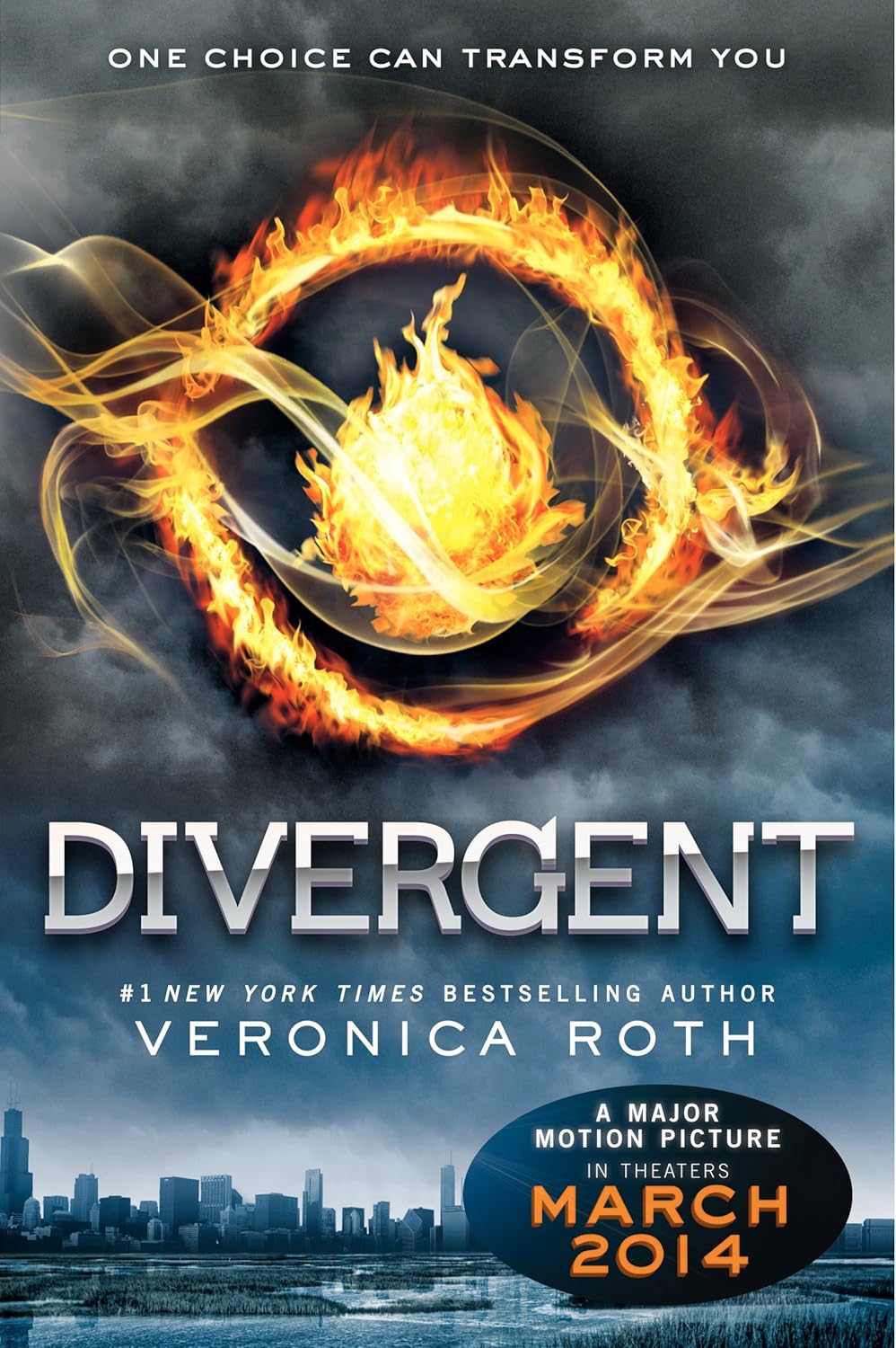
Divergent series took off in large part because of the exciting covers. (Although the Goodreads media blitz didn't hurt either, I'm sure, but promotion is another topic altogether).
Bearing this in mind, I have spent a ton of time considering how my blog looks, especially in terms of my font. I still don't think mine is great, and the first thing I would do if I made any money off of my writing or blog would be to pay someone to update it, but it's solid, readable, and represents the tenor of my writing (I hope!).
In the end, while I don't have a lot of advice to offer to many of my fellow writers, I can tell you this: font matters. And while most of us can't afford professional web designers or consultants, we can easily change our fonts. So play around with them, preview them, change them around, get some feedback. Or ignore me and point out that I should probably get back to work. Either way, you'll be doing someone some good.